

EDDIE ARCILLA
「 Filmmaker | Photographer | Designer | DJ/Producer | Bonsai Artist | Traveler 」
Eddie is an artist from Northern California who’s work range from Filmmaking, Photography, Design, Bonsai, to DJing and Music Production.
When not creating, he spends his time with his three shiba inu’s name Kyoto, Ronin, and Jager, going on adventures, going on roadtrips with friends, and being outdoors. He loves to travel abroad, motorbike, experience new cultures, and food. He get’s his inspiration through traveling, being somewhere completely different, and being outside his comfort zone.
This website is a curated hub for his artwork.
SOCIAL MEDIA
YouTube | IG: houseofintent | IG: arkilla | Facebook | SoundCloud | TikTok | IMDB | Behance | Vimeo

AWARDS
SF SUCCULENT & CACTUS SOCIETY SHOW (2025)
• Judges Award in Staging | Euphorbia Enopla
A PLACE CALLED SACRAMENTO (2021)
• Featured Short Film: Biracial Beauties
SACRAMENTO FILM AND MUSIC FESTIVAL (2019)
• Featured Short Film: LOOT
ADDY AWARD
From American Advertising Federation (AAF)
• Gold for GOTHAM Integrated Campaign
• Gold for GOTHAM Integrated Campaign
• Student Best of Show for GOTHAM Integrated Campaign
CALIFORNIA INDUSTRIAL AND TECHNOLOGY AWARD
From California Industrial & Technology Association
• First Place Award for GOTHAM Branding
• Outstanding Project for GOTHAM Branding
• Outstanding Project for Cultivate R-Space Branding
NORCAL CONFERENCE AWARD
From Journalism Association of Community Colleges
• First Place: Front Page Layout (Broadsheet)
• First Place: Student Designed Advertisement
SCC GCOM YEAR END SHOW
From Sacramento City College
• Silver in Print Design
• Silver in Web Design

HOUSE OF INTENT
The Name
The name "House of Intent" comes from the design phrase “design with a purpose" and to not merely create decorative artwork or add things for the sake of making it look good but to have intent, message in your piece. Form follows function. The word “House” represents myself and the culmination and scope of my work.
The Logo
Inside the inner circle of the logo is a stylized Japanese Kanji「 見 」that stands for sight, vision, to see. This goes hand in hand with photos and video since it’s mostly visual.
The circle represents the lens and opening of a camera. The 3 points connected to the circle represents the Exposure Triangle in photography and filmmaking which are Aperture, Shutter Speed (Shutter Angle), and ISO.
The circle is surrounded by petals creating a laurel which stands for victory and honor (Greek origin). These petals represent the aperture blades inside a lens. An effect of an aperture is making an image blurry while the subject is in focus. The blurry parts of an image is called Bokeh (ボケ) (Japanese origin).
Taking the meaning of the Kanji 見 and the meaning of the laurel, put them together and the logo stands for “Victory in Sight”. A play-on word of what you are capturing through a camera or what you are trying to capture through the your own personal lens and goals.
BRANDS AND PEOPLE I’VE WORKED WITH












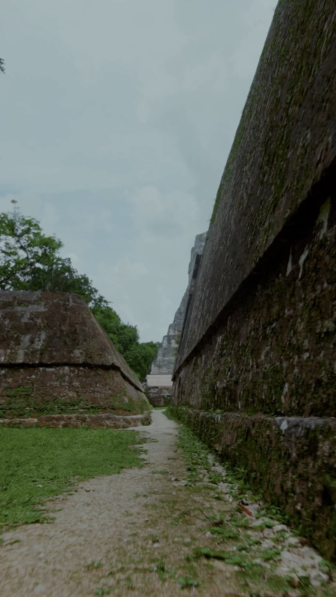
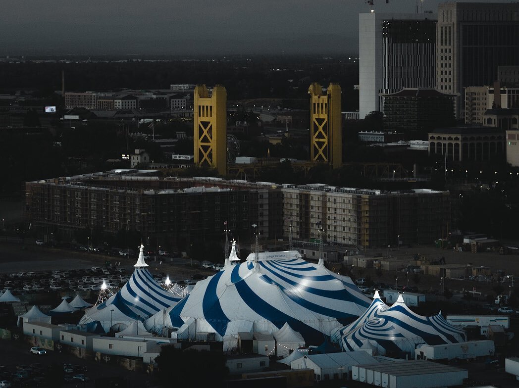
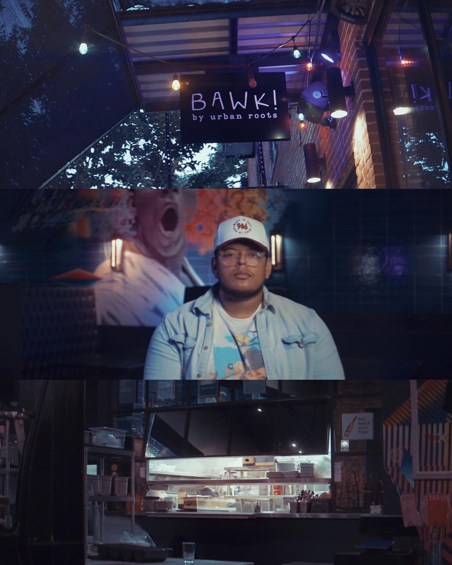
Instagram Feed











KYOTO | RONIN | JAGER
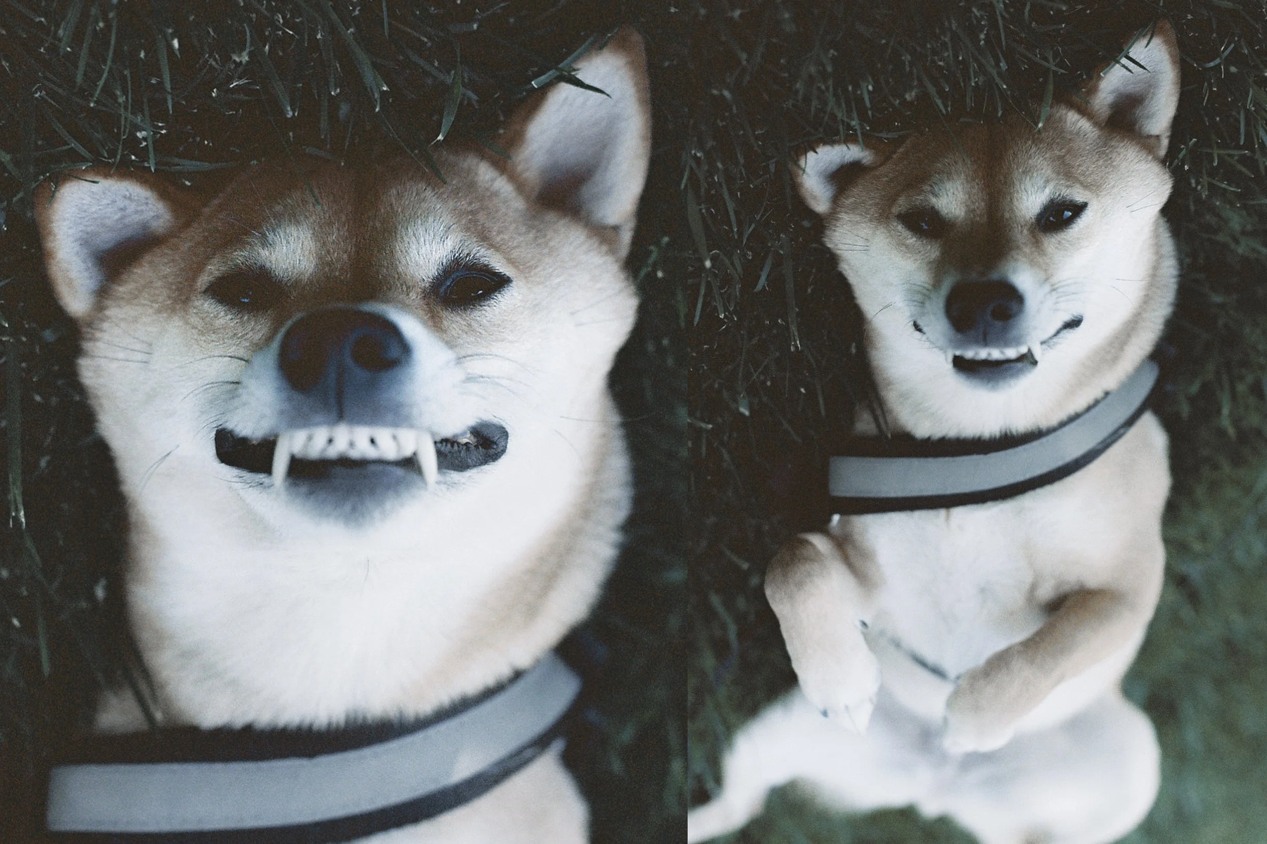
Say hello to my co-pilot and best friend, Kyoto the Shiba Inu! She’s named after my favorite place in the world, Kyoto, Japan. The meaning of Kyoto is Peace and Calm and is also known as the City of Zen. She’s very playful and energetic but she is hella chill for the most part which fits her name. Not only does she have the looks but she is very smart and sassy. I couldn’t have gotten a better doge!
INSTAGRAM: @Kyoto.Ronin.Jager
KYOTO’S GRID